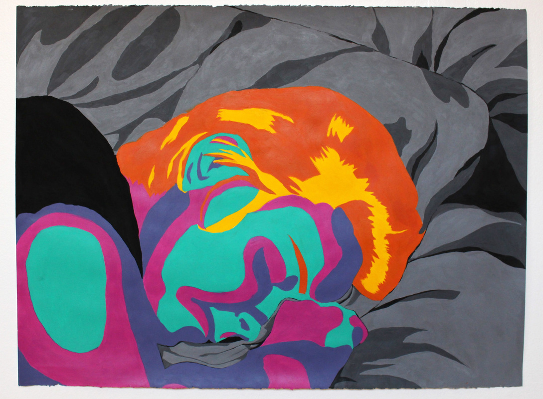
| Intelligence I don't like this piece very much. I just settled for this idea. It does look different than a lot of the other projects but it doesn't capture me as much as I would like. I chose the colors CMYK to relate to my experience with graphic design. My stance was supposed to stand out. I had never scene one of the self-portraits be of someone sleeping, and I wanted mine to stand out. This piece doesn't have a high level of technique. I wish that I would have pushed myself to do something I wasn't comfortable with. I was avoiding doing anything realistic out of fear. Investment I wasted a lot of class time. I struggled in the beginning and put off actually working on it. Almost the entire piece I did at home. I should have spent more time in the planning component of this piece. I struggled at the end to do it in time. During the last part of the project, I just wanted to be done. I was very frustrated with my progress and what it looked like. Difficulty I struggled with the concept. Originally, I wanted the portrait to be about public speaking. I went through a lot of ideas related to that, but all of them felt cliche. I settled on this idea. Actually painting the piece wasn't that difficult. The only problem I faced there was using cheap paint. I went over every section at least 3 times in order to get a solid color. I also struggled with keeping the lines clean. I don't think that I want to continue this style. I don't really have a style and I want to keep experimenting with it. Self Assessment B |
|
0 Comments
Favorite Project:
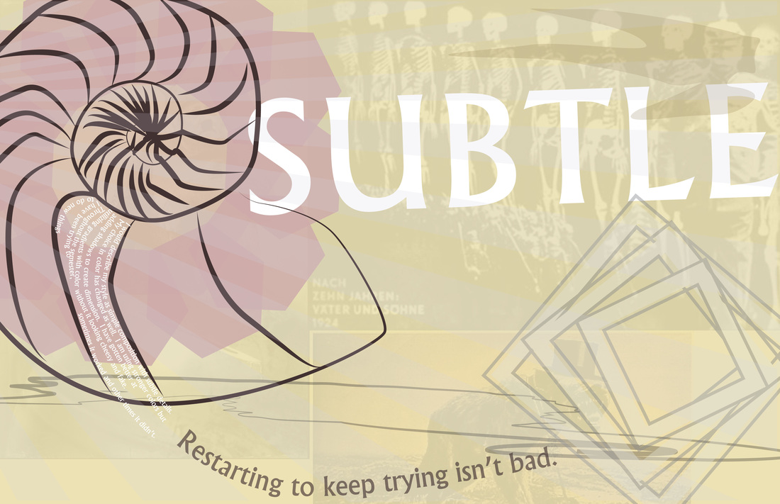
My favorite project was the second portion of the Art Deco project. I felt that they were good guidelines but we had enough room to work it was our own creativity driving the design. Even though it took me a long time to come up with an idea, I thought incorporating older design elements that are fundamentals applied to modern movies of our choice was fantastic. It brought the ideas closer to home. Most Valuable Information: The most valuable information is how color works together. It can impact the entire piece and that was a foreign concept to me. I think my pieces' color schemes have been getting better progressively because of this. That will be useful for things other than design as well. Remember in 10 Years: I will remember being in an environment that was constructive but forgiving. We learn from each other as we all get better. The details may get fuzzy, but the atmosphere will not. This class is a fantastic place to be creative and have it appreciated. The variations in line weight and muted color choices are unique to this piece. It uses these colors to give a softer feel but still having a strong message because of the details in the back. My choice of position and composition changes the effect of the piece too. I tried to create a flowing order so the viewers eye was drawn across the page. My taste in font has become evident throughout this semester. I prefer bolder fonts and tend to use very similar fonts.
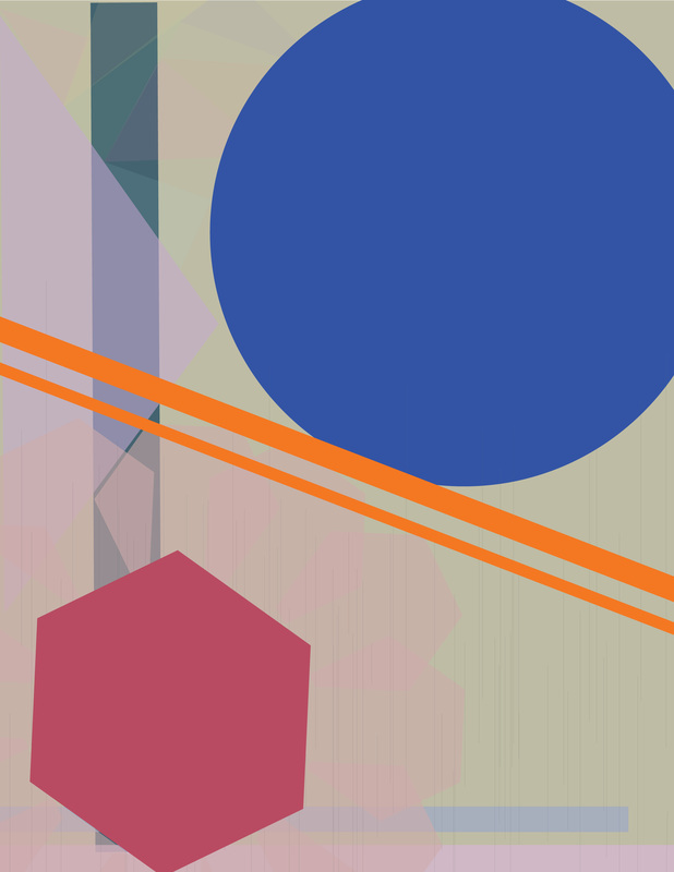
Using different shapes and changing the composition has been a huge part of my process. I began with very simple clean lines and shapes and eventually moved to complicated edges. In the beginning, I really liked monochromatic color schemes and similar shapes. I thought about the illusions that were associated wit my design. I thought design was more about placement than what was in the piece.
I evolved to do more and more complex pieces and broadening my reach. I used my colors and learned every aspect of a piece is important. Color is a huge tool and can add quite a lot to a design. So many parts go into a successful design and the best way to get there, I need to play around with the tools I have. I believe my last project is the strongest because it has a clear message and goal that it is conveying. I think being experimental with color is the biggest chunk of knowledge I have gained. |
AuthorSecond year in design classes taken at my high school. Archives
October 2015
Categories |
 RSS Feed
