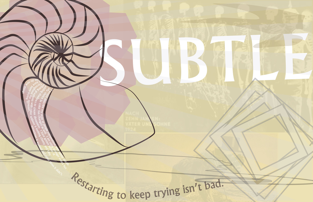
The variations in line weight and muted color choices are unique to this piece. It uses these colors to give a softer feel but still having a strong message because of the details in the back. My choice of position and composition changes the effect of the piece too. I tried to create a flowing order so the viewers eye was drawn across the page. My taste in font has become evident throughout this semester. I prefer bolder fonts and tend to use very similar fonts.
|
|
AuthorSecond year in design classes taken at my high school. Archives
October 2015
Categories |
 RSS Feed
