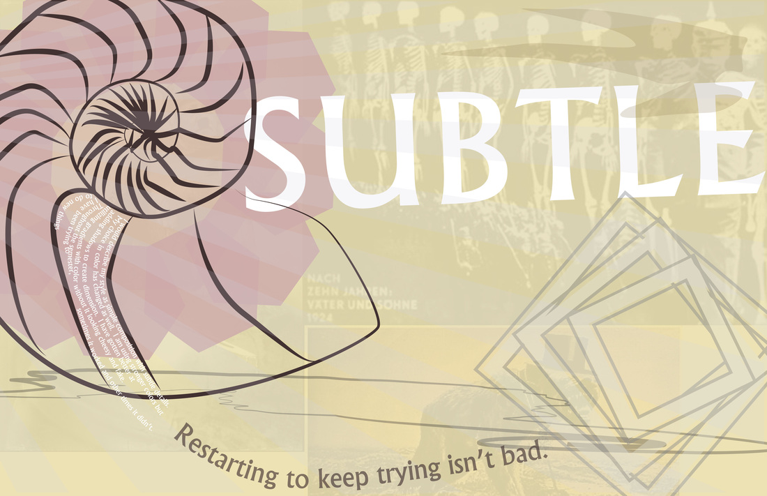
The variations in line weight and muted color choices are unique to this piece. It uses these colors to give a softer feel but still having a strong message because of the details in the back. My choice of position and composition changes the effect of the piece too. I tried to create a flowing order so the viewers eye was drawn across the page. My taste in font has become evident throughout this semester. I prefer bolder fonts and tend to use very similar fonts.
|
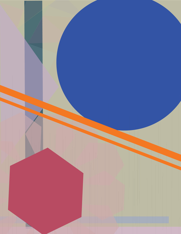
Using different shapes and changing the composition has been a huge part of my process. I began with very simple clean lines and shapes and eventually moved to complicated edges. In the beginning, I really liked monochromatic color schemes and similar shapes. I thought about the illusions that were associated wit my design. I thought design was more about placement than what was in the piece.
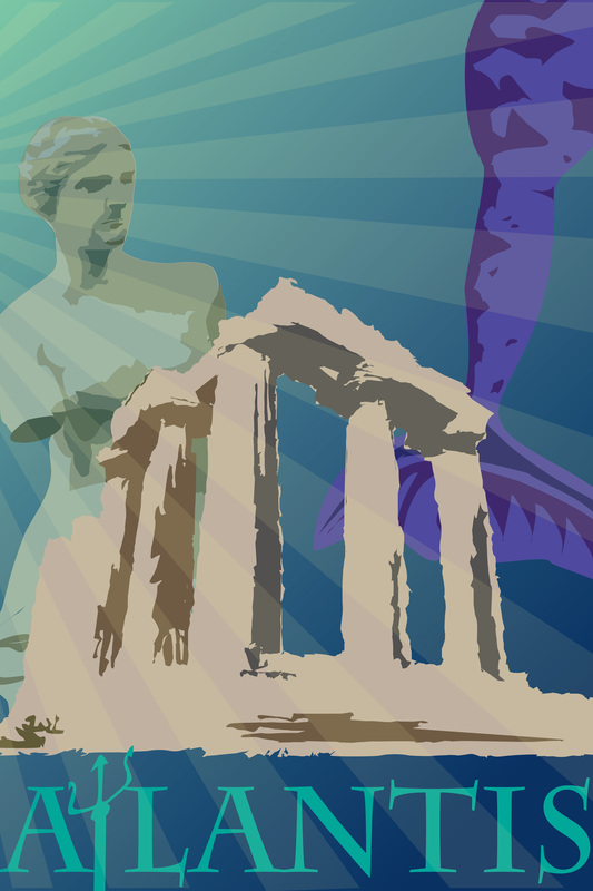
I evolved to do more and more complex pieces and broadening my reach. I used my colors and learned every aspect of a piece is important. Color is a huge tool and can add quite a lot to a design. So many parts go into a successful design and the best way to get there, I need to play around with the tools I have. I believe my last project is the strongest because it has a clear message and goal that it is conveying. I think being experimental with color is the biggest chunk of knowledge I have gained. |
AuthorSecond year in design classes taken at my high school. Archives
October 2015
Categories |
 RSS Feed
